A complete digital identity and platform for WHAN, aligning their online presence with the strength and impact of their work.
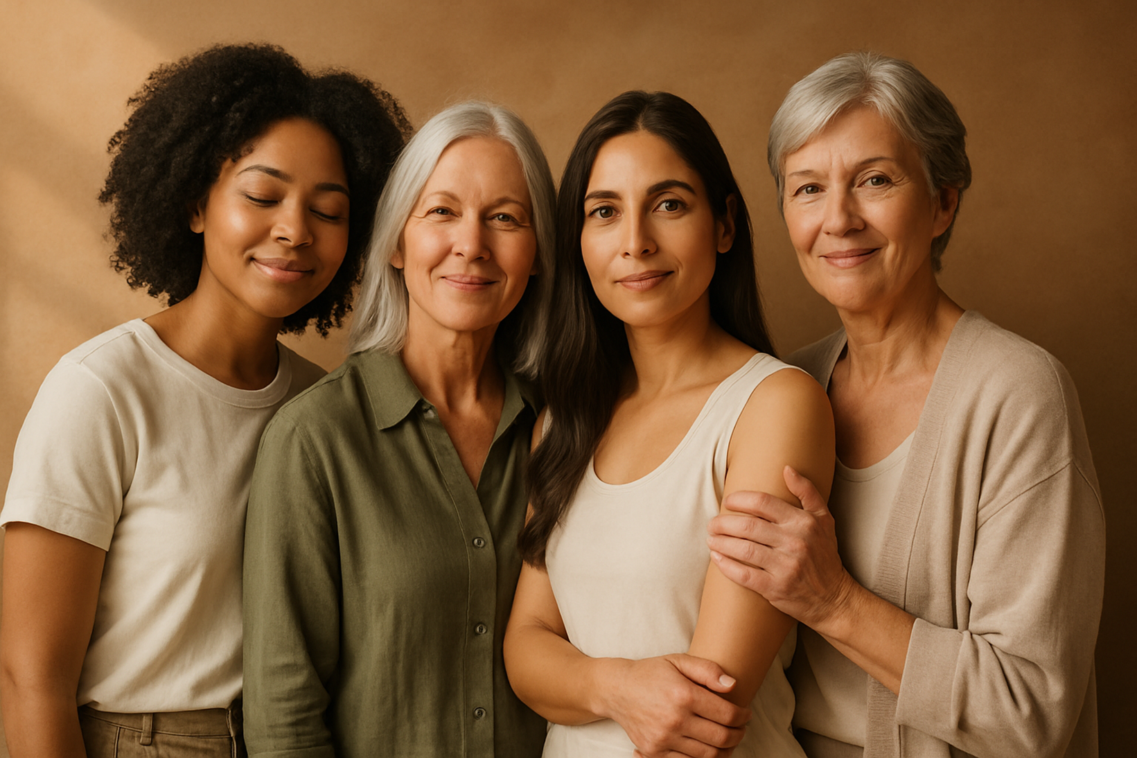
The Women’s Health Advocacy Network (WHAN) is a charity committed to relieving the needs and protecting the physical and mental health of women and girls who have survived rape or sexual abuse in the UK and beyond.
Structure that reflects the weight of the mission.

The organisation’s mission carried depth and authority, but its digital representation lacked the clarity and presence required to communicate that strength. The experience did not convey the structural discipline or credibility of the work being done.
A refined digital identity was established from the ground up including logo development, visual system definition, interface design, and structured content architecture. Every element was designed to reflect seriousness, trust, and long-term resilience. The result is a cohesive digital presence that mirrors the power of WHAN’s mission and positions the organisation as a trusted and authoritative destination.
Experience Definition
The experience was defined as a calm, structured gateway into WHAN’s work. The platform needed to feel steady, intentional, and safe to approach particularly for users navigating sensitive subject matter. Clarity, hierarchy, and legibility were prioritised over visual expression, ensuring the interface supported the content rather than competing with it.
At the same time, the system had to communicate credibility and organisational strength to donors, institutions, and strategic partners. The final framework balances emotional sensitivity with architectural precision, allowing different audiences to access information intuitively while reinforcing trust at every touchpoint.

Libre Baskerville was used for headings to introduce clarity and authority without feeling rigid or institutional. Its editorial character helps anchor important information and gives weight to sensitive content without appearing aggressive or clinical.
Nunito Sans was chosen for body text for its openness and readability across screen sizes. Its rounded forms create a softer reading experience, reducing visual strain and making longer passages easier to process especially in emotionally sensitive contexts.

More Than a Logo, A Story in Design
The WHAN logo was created as a story in itself. Inspired by the experience of founder Adama Bah, each stage of the design reflects her journey from silence and pain, to healing, empowerment, and finally to supporting others.
I was deeply touched by Adama’s story. My goal was to capture her essence, resilience, and beauty, and to visualise her journey step by step transforming it into art that became the WHAN logo.
And this is how that journey unfolds…

The Seed / Cocoon
Represents the beginning: a girl carrying pain and silence, but also the hidden potential for renewal. Like a seed underground or a cocoon holding transformation, this stage is closed, inward, and waiting for light.

The Blooming Lotus
Strength transforms into compassion. The design reflects light, love, and dignity returning the survivor beginning to extend care outward.

The Return Of Love
Like a lotus rising through mud, healing begins. The shapes open up, symbolizing resilience and growth. A new self starts to emerge.
Hands of Support
The final emblem incorporates supporting hands, symbolizing WHAN’s mission: survivors supporting survivors, communities lifting each other, and a safe space for healing. This is the WHAN logo today strong, minimal, and timeless.
Creating the Website
The final interface translated strategy and structure into a refined digital system. Every layout decision, spacing rule, and typographic hierarchy was designed to support clarity while maintaining emotional sensitivity.
Visual restraint was intentional. The design avoids excess and instead focuses on balance, rhythm, and trust. The result is a high-fidelity platform that feels calm, credible, and enduring.
Impact
The redesigned platform helped WHAN present itself with clarity and credibility, directly supporting stronger institutional conversations and funding opportunities.
The new identity improved brand recall especially the symbolic hands while significantly simplifying navigation for users seeking trusted information.
Secured High Institutional Support
Recognisable Visual Identity
Improved Information Access